")
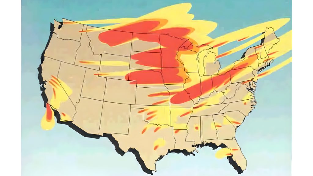
Maps that rank “safe” states in a nuclear fallout scenario can look deceptively simple. The underlying science is not. Fallout patterns depend on where a weapon detonates, whether it strikes the ground, how much dust is lofted into the cloud, and what the atmosphere is doing hour by hour.
That is why the most useful way to read these simulations is not as a survival guide, but as a geography lesson in risk. Some states consistently appear on the lower end of exposure models tied to attacks on U.S. missile fields, while other parts of the country sit much closer to the highest projected doses.

1. Maine benefits from distance, wind patterns, and sparse targeting
Maine repeatedly appears among the lowest-exposure states in average-case fallout simulations tied to attacks on silo fields in the central United States. The reason is straightforward: it sits far from the densest missile-silo regions and lacks the kind of strategic concentration that would make it an obvious primary target in that specific scenario. Geography does part of the work, but not all of it. Fallout from a ground burst is driven by radioactive dust and debris pulled into the mushroom cloud, and the farther a state is from the source region, the more chance there is for particle spread and dilution before significant deposition occurs. Maine’s low population density also matters from a civil-defense standpoint, because congestion and shelter shortages are less severe than in denser corridors.

2. Rhode Island looks safer on maps because it has fewer obvious strategic targets
Rhode Island’s advantage is less about physical shielding and more about target logic. In silo-attack scenarios, it sits outside the core downwind danger zones and lacks a major concentration of land-based nuclear infrastructure. Its small size does not automatically make it vulnerable in fallout terms. What matters more is projected dose, and models cited in public reporting placed the safer states in a range of 0.001 Gy to 0.5 Gy in average-case conditions, far below the most dangerous projections near missile fields. That still does not make the state immune to contaminated food, water disruption, or longer-lived environmental effects.
3. Michigan gains a buffer from the main silo belt
Michigan stands out because it is removed from the core cluster of missile silos in states such as Montana, North Dakota, Wyoming, Colorado, and Nebraska. In broad fallout maps, that separation tends to reduce direct exposure compared with the central Plains. Northern Michigan and the Upper Peninsula add another layer of separation from major urban concentration. The Great Lakes do not act as a magic shield, but the state’s position away from likely ground-burst zones helps explain why it appears in lower-risk groupings. In practical terms, that means less modeled early fallout than in the states closest to the “nuclear sponge” concept, where silo fields absorb the first wave of warheads.
4. Kentucky combines rural depth with lower projected dose
Kentucky does not usually lead these lists because of one dramatic feature. It shows up because several smaller advantages add up: moderate population density, substantial rural land, and distance from the most heavily modeled silo targets. That matters because early fallout is mainly a short-term hazard from gamma radiation after radioactive particles settle to the ground. According to the National Academies, surface bursts produce radioactive fallout by lofting contaminated dust into the air, with the heaviest local danger shaped by wind and particle size. A state farther from those surface bursts can still face contamination problems, but its dose outlook is often less severe in nationwide maps.
5. Tennessee benefits from terrain and position, not immunity
Tennessee often lands in the comparatively safer band for the same broad reason as Kentucky: it is outside the highest-dose core around the central missile fields. The Appalachian sections of the state also add topographic complexity that can matter in dispersion, even though largescale public models often simplify terrain. That simplification is important. The National Academies review notes that fallout predictions become less certain in complex topography and changing weather, and that mountains can alter transport in ways flat-earth assumptions miss. Tennessee’s relative advantage is therefore real in broad comparisons, but it is still only a model-based advantage, not a guarantee.

6. New England as a whole forms one of the broadest lower-risk corridors
The bigger story is not just one state. It is a region. In simulations centered on attacks against U.S. land-based missile silos, much of New England consistently falls into the lower projected exposure category, including New Hampshire, Vermont, Massachusetts, Connecticut, and often neighboring Mid Atlantic states as well.

This pattern reflects a basic engineering fact of fallout: location matters as much as weapon yield. A ground-level strike on hardened silo targets creates more contaminated dust than a higher airburst, and the resulting plume is then shaped by upper-level winds, precipitation, and particle settling. Public-facing maps simplify those mechanics, but the regional result is consistent enough to show up across multiple discussions of the same scenario. Even so, John Erath of the Center for Arms Control and Non-Proliferation warned that “Nowhere is truly ‘safe’ from fallout and other consequences like contamination of food and water supplies and prolonged radiation exposure.”
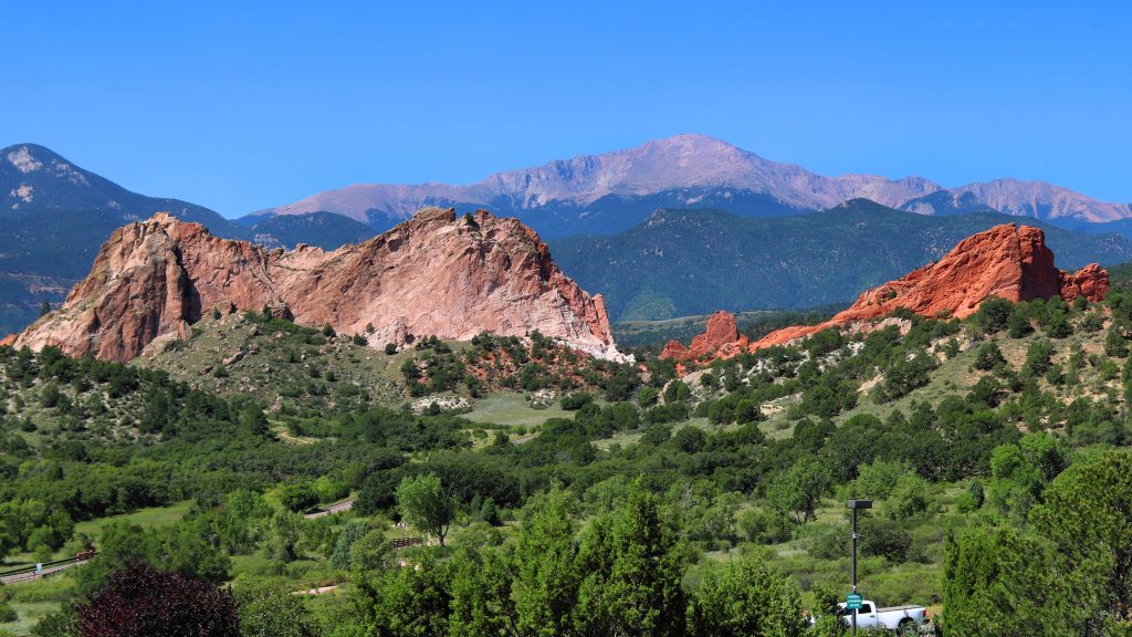
7. Colorado helps explain why “safe state” maps have limits
Colorado is often used as the counterexample that keeps these rankings honest. It is near silo regions in some strategic scenarios, and historical research also shows that fallout can travel much farther than intuition suggests. More recent analysis of Trinity test deposition found elevated contamination in parts of Colorado and other Western states, reinforcing a central lesson: the map changes with the event. Fallout can be intensified by rainout, shifted by wind shear, and deposited in unexpected “hot spots.” The long legacy of contamination debates around places such as Rocky Flats further shows that radiological risk is not only about the initial plume.
It can also be about what remains in soil, water, and public memory long after the headline event is over. The states that look best on fallout maps usually share three traits: distance from prime strategic targets, lower likelihood of heavy early deposition, and less exposure to the main downwind corridors in silo strike scenarios. That is useful context, but it is not the same as safety. Fallout science is a study in variables. Geography helps, weather reshapes everything, and the difference between a broad low-risk zone and a dangerous plume can come down to the details of burst type, wind, terrain, and timing.

