
“iOS 26 beta 3 nerfs Liquid Glass,” AppleTrack’s Sam Kohl announced on X, part of a sentiment spreading among the design community. Apple fans and UI experts alike, the latest developments surrounding Apple’s Liquid Glass design language are not just a question of taste its a critical juncture in the development of digital design and usability.
Since its WWDC 2025 introduction, Liquid Glass has been the central focus of Apple’s most sweeping visual redesign in a decade. The look’s hallmark combination of translucency, depth, and dynamic light held out the promise of a new level of interface clarity and joy. However, as the developer betas continue, Apple’s refinements particularly in beta 3 have sparked praise and outrage. What do these adjustments portend for users, designers, and the overall trajectory of interface design? In this case, nine notable shifts disclose the new shapes of Apple’s vision.
1. The Great Opaqueness Debate: Navigation Bars and Readability
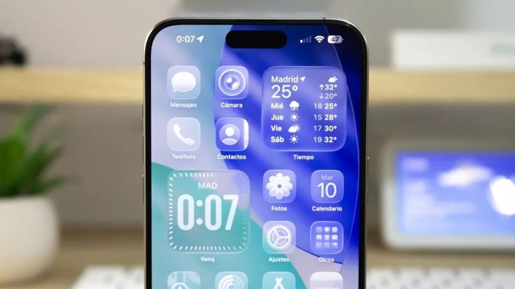
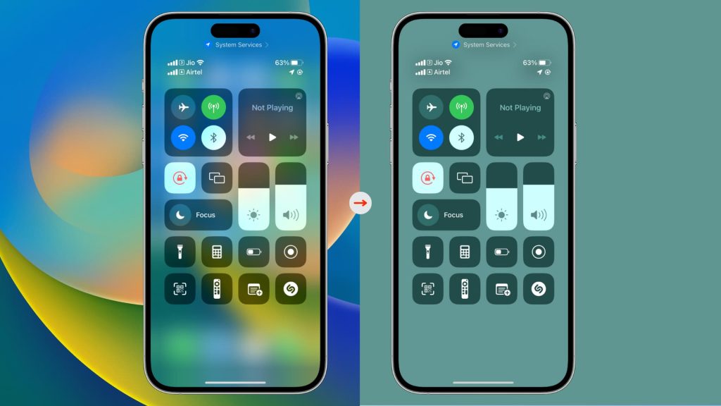
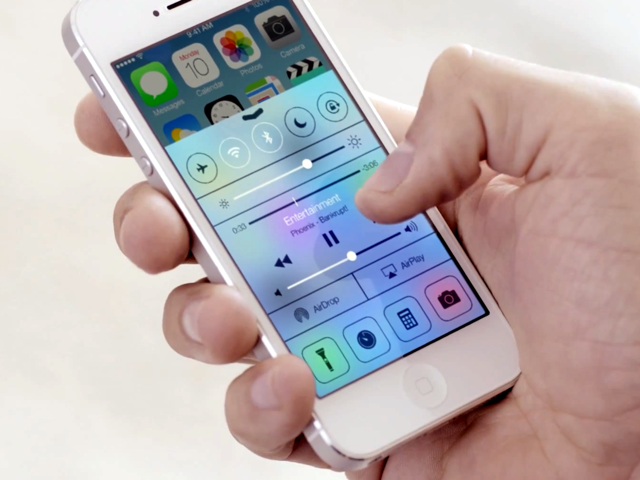
Apple’s most visible action in iOS 26 beta 3 is a clear lean toward more opaque navigation bars in main apps. In Apple Music, the bottom bar’s once-vivid translucency has been replaced by a frosted, solid appearance, especially pronounced when scrolling over colored backgrounds. This isn’t an isolated tweak Safari’s URL bar, the App Store’s navigation, and Podcasts’ controls have all adopted this denser look. According to side-by-side comparisons, the effect is most dramatic in Compact View, where the navigation bar was previously the most translucent. The justification is obvious: increased readability and less visual noise. According to TechCrunch, Apple is answering criticism that too much transparency made various UI elements difficult to read. But this has also been blamed as backtracking from the original Liquid Glass vision.
2. The Science of Glassmorphism: Depth, Blur, and Accessibility
The Liquid Glass look takes inspiration from the larger pattern of glassmorphism, a design aesthetic defined by stacked translucency and background blur. As the Nielsen Norman Group describes it, glassmorphic components provide depth and visual hierarchy, but misuse or bad contrast can negatively affect usability. Apple’s tweaks scaling back transparency and adding more blur are tried-and-true techniques to enhance text readability and meet accessibility requirements. The combination of opacity and blur is not an aesthetic exercise; it’s an intentional weighting to retain interfaces visually interesting but operationally uncluttered. Best practices recommend additional blur, particularly over intricate backgrounds, to help users concentrate on content without distraction.
3. Adaptive Transparency: Contextual Awareness and Dynamic Layers
Liquid Glass is not only a graphic inspiration it’s an awareness material that responds in real-time. As outlined in Supercharge Design, the system applies lensing and dynamic light control to make it easy for users to perceive interface structure. Navigation bars bend and shift, and levels of transparency change depending on content, background colour, and user settings. This translates to retaining more transparency in Dark Mode, for instance, to maintain depth, while Light Mode receives a thicker frost for legibility. Apple’s design system even permits the override of these effects by accessibility toggles so that inclusiveness is not at the cost of the intent of the design.
4. The Frosted Glass Effect: A Legacy of Apple’s Visual Innovation
The path to Liquid Glass stems from Apple’s long history of seeking immersive, touch-based interfaces. The “frosted glass” effect, which debuted in iOS 7, was a visual innovation in layering and contextual awareness. As outlined in Mediology Software’s retro, this design language developed across iOS 10–17, with each upgrade smoothing out translucency, blur, and depth. With iOS 26, Apple is extending this metaphor further, combining real-time rendering, parallax, and environmental adaptation. The aim: to build interfaces that are both digital and palpable, providing users with a sense of presence and continuity between the physical and virtual realms.
5. Feedback from Users and the Design of Iteration
Apple’s willingness to iterate according to feedback from users is a characteristic of its design process. The back-and-forth about translucency and opacity on the Liquid Glass betas is a clear reflection of user input. As it is reported by The Verge, some users are mourning the loss of dramatic transparency, terming it a “step backwards,” but others welcome the enhanced clarity. This conversation between Apple and its public is not unprecedented; it reflects the progress from skeuomorphism to flat design and now dynamic glass. The developer beta now in progress is not the final form Apple will surely continue to dial in the balance between aesthetic creativity and day-to-day functionality before launching it to the public.
6. Visual and Functional Transparency: Empowering Users
Transparency in UI is not just a design preference it’s a function of user empowerment and trust. As indicated in Medium’s exhaustive guide, visual transparency generates depth and captures attention, while functional transparency sets users up to comprehend system functionality. Apple’s Liquid Glass exploits both, so that users can predict what will happen next and never lose context. By making system processes visible and understandable, Apple creates ownership and interest, characteristics of excellent user experience.
7. Cross-Platform Consistency: Liquid Glass Beyond iOS
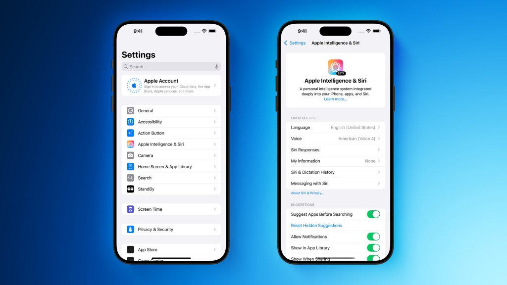
The Liquid Glass design is not limited to iOS. According to The Verge, Apple is launching this look across macOS, iPadOS, watchOS, and tvOS, with a consistent visual language. This cross-platform consistency is unprecedented Alan Dye, Apple’s VP of human interface design, called it “our broadest design update, ever.” The implications for developers and designers are significant: interfaces must now adapt to a wider range of devices and contexts, demanding new approaches to layout, interaction, and accessibility.
8. The Future: Spatial Computing and 3D Liquid Glass
Ahead of the game, Apple’s vision for Liquid Glass continues to the world of spatial computing and augmented reality. The Vision Pro and visionOS bring dynamic, floating UI layers that adapt to light in the world and to the movement of the user. As Mediology Software points out, this represents a move away from 2D metaphors toward immersive, 3D experiences wherein digital objects become weighty and manipulable. The liquid nature of these interfaces rippling, refracting, and shaping in space announces a new age of how humans will interact with technology.
9. Designers’ Best Practices: Navigating the Liquid Glass Era
For developers and designers, the advent of Liquid Glass requires a delicate balance between aesthetics and usability. Primary tactics involve ensuring contrast of text, working with blur as a means of managing complexity, and offering user controls for transparency where feasible. As Nielsen Norman Group suggests, glassmorphism should be applied judiciously to create depth and attention, rather than as a global effect. Apple’s changing APIs and design documents will be valuable assets as the community learns to work with this new framework.
Apple’s Liquid Glass odyssey is more than a stylistic makeover it’s an experiment in how technology, design, and user input merge to forge the future of digital interaction. With iOS 26 heading toward public debut, the balancing act between visual novelty and functional ease will be front and center. For Apple fans, designers, and developers, the next few months provide a unique chance to see and help shape the next installment in interface design history.
